Top 5 at The Other Art Fair NYC
Cesar Finamori. Debbie Vivian
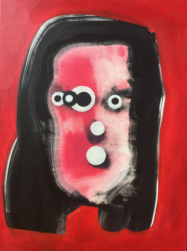
Cesar Finamori
It’s nigh-on-impossible to squeeze everything that’s important about Cesar Finamori into the two short paragraphs below. Nonetheless, I’ll try my best. Firstly, there’s a process of composition at work in each of his paintings. Finamori’s influenced by Henry Darger, the (posthumously) famous exemplar of ‘outside art’ in the twentieth century. Finamori’s fictional sitters’ surnames pay homage to Darger’s In the Realms of the Unreal otherwise known as The Story of the Vivian Girls which was written sometime after 1909 and is yet to be fully published. Darger’s drawings and watercolours were primarily traced from a wide variety of source materials. Finamori’s sketches (which are actually acrylic paintings) are composed of a process by which shapes are both painted and then partially erased to produce the stark lines of the sketch. In this way, there’s something of a homology between Darger—and Yves Klein, another of Finamori’s influences—and the compositional process through which the ‘lines’ of the drawings are thus produced. Secondly, there’s always been something weird about Darger. In fact, many commentators have gone to great lengths to correctly ‘diagnose’ him. Instead of relying upon (notoriously unreliable) psychiatric categories; I’d suggest an aesthetic reading of Finamori’s fictional portraits via Wilhelm Worringer’s well-known Abstraction and Empathy (1907) in relation to Darger, Klein, Matisse. Finamori’s influences often disdained perspective in favour of ‘flattening’ their paintings. ‘Suppression of representation of space was dictated by the urge to abstraction through the mere fact that it is precisely space which links things to one another,’[i] says Worringer. In this way, abstraction is the counter pole to aesthetic empathy and the ‘simple line and its development in purely geometrical regularity was bound to offer the greatest possibility of happiness to the man disquieted by the obscurity and entanglement of phenomena.’[ii] Whereas Darger’s artworks-cum-writings depicted the Vivians against a backdrop of bewildering violence; Finamori’s are depicted against a backdrop of ‘action painting’ intimating violence. Crucially, their essential features are then entirely abstracted…
Finamori’s fictional portraits are still portraiture. His painted visages suggest its rhyming connotation. And yet, it’s still a recognisable face. However, it’s form has become more fantasy and more mirage. It’s more inchoate and nebulous than defined. And yet, the eyes, noses, and nostrils have become more and more defined. In fact, they’ve become too defined, too precise, and too abstract. For they’re no longer eyes, noses, and nostrils. Instead, they’ve become pure circles, pure voids. Perhaps, pure machine? Or perhaps, they’ve become petri dishes spawning other petri dishes. If so, Finamori’s not interested in their amoeba or bacteria. He’s interested in the petri dish itself. Indeed, the pure circular forms of the eyes, noses, and nostrils spread out and colonise the vague visage of what was once the subject’s face. There’s something mechanical about their progress… I’ve got to move onto discussing the other artists. It’s obvious however, that Finamori is possessed of a rare and visually striking talent.
[i] Wilhelm Worringer, Abstraction and Empathy, trans. by Michael Bullock, (Chicago: Elephant, 1997), p.22
[ii] Ibid, p.2

Carl Grauer. Charger.
Carl Grauer
Carl Grauer’s still life paintings are very different to, say, Sara Zaher’s new media prints. [N.B., see next artist on this list.] Zaher’s prints evoke the immediate buzz of the here and the now; Grauer’s still lifes musealise the present as it becomes the past. His Noxzema Jar (2017) has already been sold. I’d advise collectors to purchase his other still lifes while they still can. They’re thoughtfully, even wistfully, painted. Each depicts a common household object as if they’re slowly receding into the past, archive, collection, and museum. Impressively, this is achieved with such understatement that it belies the trope of musealisation itself. Andreas Huyssen has argued that since ‘the 1980s, it seems, the focus has shifted from present futures to present pasts,’[i] which interestingly suggests that Zaher’s artworks already belong to a tradition of sorts… Huyssen’s Present Pasts (2013) had focussed on literary, cinematic, and monumental culture rather than the comparatively lowlier forms of artistic expression such as the still life. Nonetheless, it’s precisely this comparative lowliness or modesty that makes these paintings so convincing. After all, the still life remains perhaps the most traditional and understated of the painter’s crafts.
Grauer’s still lifes suggest an imaginary museum commemorating our everyday bric-à-brac: old jars; perfume bottles; salt and pepper shakers; pliers; clips; even laptop chargers. In fact, the laptop charger is my favourite. Computers. It’s difficult to think of a more perfect example of the present becoming the past so quickly. There’s something especially collectible about these paintings. Perhaps, because the objects already seem to have been collected, curated, and already arranged by the artist himself. Grauer paints on copper rather than canvas. Over time, those parts of the copper still left exposed will oxidise and continue to paint themselves. For now, however, they continue to catch the light. So too, our mason jars, perfume bottles, salt and pepper shakers, and laptop chargers. In time, these too will be forgotten. And yet, you’ll be able to gaze upon their portraits in these comely still lifes.
[i] Andreas Huyssen, Present Pasts, Urban Palimpsests and the Politics of Memory, (Stanford: Stanford University Press, 2003), p.11

Sara Zaher. What Now
Sara Zaher
Sara Zaher’s ‘new media’ prints offer an acerbic and cynical diagnosis of our contemporary condition. Indeed, they revel in it and are desperately, desperately, funny. She lampoons our obsession with social media in a ‘vaporwavey’ and ‘seapunk-esque’ aesthetic. She’s exhibited internationally since 2016 and is making her second appearance at The Other Arts Fair. Her artworks invite ‘theory’ despite their, supposedly, shallow subject matter.
Claude Lévi-Strauss famously drew upon Marcel Mauss’ The Gift (1925) to posit reciprocity and exchange as the fundamental relationships that structured society. Zaher’s Follow for Follow comments upon its contemporary, ersatz, mutation. What’s your Poison reframes this mutation as worse than ersatz: it’s now junk; for junkies. What Now? depicts a skeleton without ‘comments’, ‘likes’, or ‘friends’. It’s Baudrillardian if the absence of ‘speech’, ‘interest’, and ‘friendship’ in the ‘networks’ of new ‘media’ (let’s not forget that these are ‘new media’ prints) is the death of subjectivity and the absence of life in the infinite jest of our programmed desires. It’s the death of the social despite our so-called social networks. In brief, the relation that links subject with subject and subject with object is replaced under capitalism with ‘commodity fetishism’ as each relation appears as one between objects and other objects. In late capitalism, even the object recedes in favour of the image. We’re now entirely mediated and too immersed. The subject is as impossible as subjectivity itself. Instead, ‘reality’ (if it ever existed) is now formed of pure media without reference to real. It’s the precession of simulacra. It’s ‘comments’ for ‘critique’ and ‘likes’ for ‘exchange’ and ‘fb friends’ for genuine ‘friendship’. It’s the ‘network’ instead of the ‘community’. Zaher’s What Now? thus critiques (or, less generously, merely ‘comments’) in much the same vein as The (Modern) Thinker. In this print, Zaher had cleverly hijacked Rodin’s Le Penseur and subjected it to detournément thus producing a postmodern memento mori. It’s Yorick for the 21st Century: ‘Alas poor Yorick! I knew him, Horatio; a fellow of infinite jest, of most excellent fancy; he hath borne me on his back a thousand times; and now, how abhorred in my imagination it is! My gorge rises at it.’[i] It’s ironic of course: my gorge does rise and yet my computer types these very words. We’re all complicit in the death of the social and the rise of social networks…this is a blog post after all. Finally, it’s enough to say that each of these works is imbued with a dystopian ecstasy. They’re funny AF. Zaher correctly diagnoses our desperate and mediated condition. Indeed, she revels in it. They’re terrifically smart-arse cynical and definitely collectible.
[i] William Shakespeare, The Tragedy of Hamlet, in The Works of Shakespeare, ed. By Edward Dowden, (London: Methuen & Co., 1899). p. 196
Ekaterina Popova
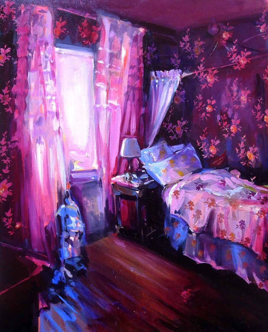
Ekaterina Popova. Sylvie's Room.
Ekaterina Popova’s returned from a residency at the Skopelos Foundation in Greece just in time for The Other Arts Fair NYC. Popova sells quickly. In fact, everything from 2016, 2015, and earlier, is already sold. If you’ve already missed out: ‘Rano Utrom’ is on permanent public display at Kutztown University.
Popova’s paintings suggest something of a struggle between the brush and the paint. Occasionally, the brush wins and the colours imperceptibly arrange themselves from tone to tone thus slowly revealing the quiet stillness of a neat and tidy room. Often, the colours win and force the brush into a frenzy of lurid pinks, purples, and blues. It’s as if they remember the brush. How it used to blend them. How it robbed them of their individuality… Now, they’ve escaped! Impasto! Impasto! Impasto! They’ll punish the brush into a frenzy. They’ll run amok over the previously tidy rooms. They’ll leave the bed and the laundry unmade. Now, the rooms are messy and replete with their unbridled performance. It’s oil on the canvas, thickly. It’s seriously impressive and compelling painting. There’s something remarkably entropic at work in these paintings. It’s the law of order and disorder. It’s this struggle between the brush and the paint. It’s often entropy that makes artworks so appealing. It’s that sense of energy lost—yet now valorised. Popova’s artworks are all the more appealing because of this struggle. In case you missed it, there’s another element at work in these paintings. Popova imprints decorative patterns into the recently dried oils. It’s as if she’s stamping an authority on this unruly and vying pair.

Anne Vandycke. Climate Change.
Anne Vandycke
Anne Vandycke’s artwork revolves around a single and foremost concept, duality. ‘Duality’s consistent in all my works, even in my previous collection.’ I’d been busy researching Vandycke before asking her some questions in preparation for The Other Art Fair. I’d also suggested that her previous collection—or so it seemed to me—revolved around the concept of global warming given their titles: ‘Melting Ice’, ‘Permafrost’, and ‘Climate Change’. Vandycke’s reply was rather abstract. Perhaps, this is unsurprising given each painting’s style. ‘Ice is a solid element but melting ice is a transitional state between solid and liquid which can evolve in these two ways according to external temperature.’ ‘And,’ I persevered, ‘what of climate change?’ ‘It illustrates,’ she replied, ‘this kind of situation. It opens up possibilities between different states which can evolve in the direction of improvement or deterioration.’ ‘Spacial Duality,’ she continues—and yes, she spells it ‘spacial’ rather than ‘spatial’ although I’d wondered whether this was derived from the ‘glacial’ of her previous works—is ‘mainly about exploring possibilities inside or outside space, which is our space, our environment. It’s less restrictive than climate change but it can include it.’
In emphasising ‘climate change’ in particular; I’d clearly overlooked ‘duality’ in the universal. It’s clear that Vandycke is possessed of an inimical and analytical character. It’s noticeable in her paintings. It’s what makes them, them. It’s probably what makes her, her. I asked her one final question: ‘It sometimes seems as if there’s something ‘violent’ at work in your paintings. For example, the bright reds in some of your later works, or the sharp lines that dissect the canvas as geometric forms?’ Vandycke’s answer: ‘World is violent and smooth at the same time.’ Of course, I should’ve know: It’s a duality. She does admit, however, that red is her favourite colour.
